
Portfolio
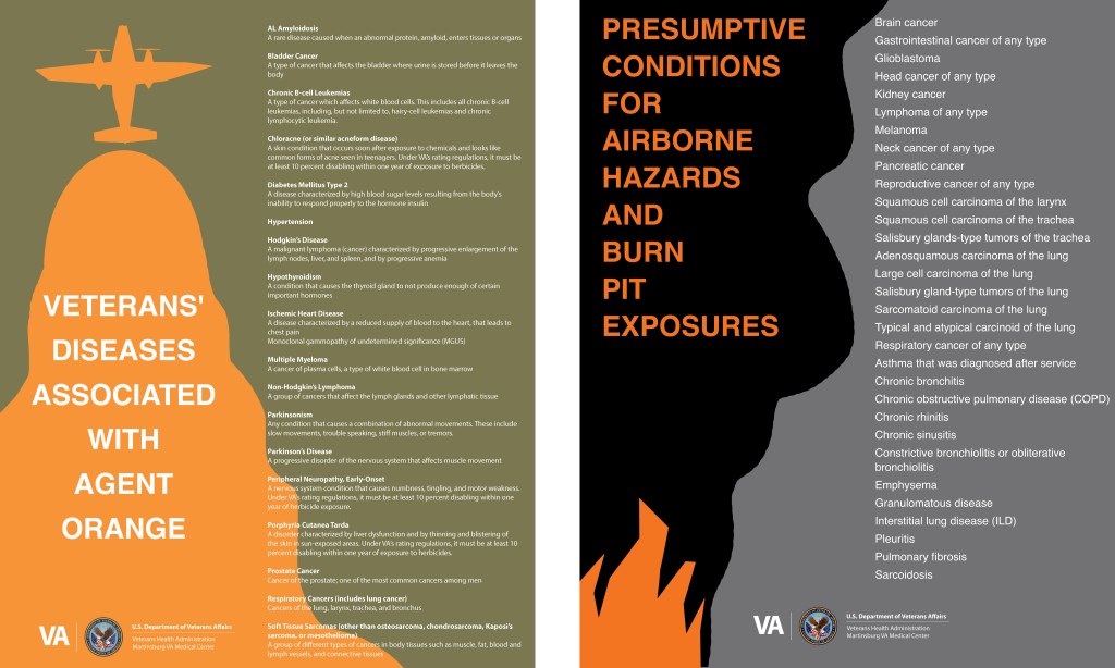
In response to growing awareness of hazardous exposures experienced by Veterans during military service, a physician at the Martinsburg VA Medical Center requested two posters identifying diseases associated with Agent Orange, burn pits, and other airborne hazards. With extensive lists of conditions to communicate, I focused on a clean, uncluttered layout that could accommodate the information while using bold typography and strong visual hierarchy to emphasize its importance and help Veterans identify potential health concerns.
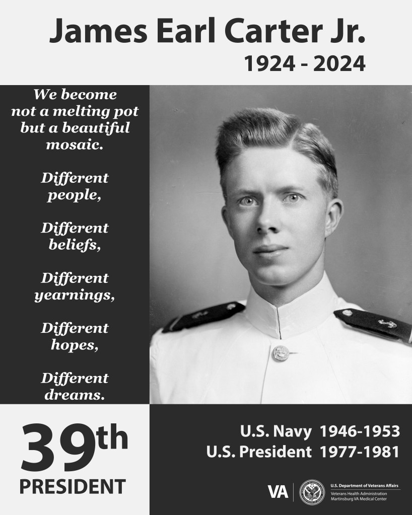
Following the announcement that former President Jimmy Carter had entered hospice care, I was tasked with creating a poster for a memorial display at the Martinsburg VA Medical Center. The design honored his service in the U.S. Navy and his years as President of the United States. Using his black-and-white service portrait as my starting point, I carried its monochromatic palette throughout the design. This approach created a clean, professional, and timeless tribute to a man whose life of service deserved recognition and honor.
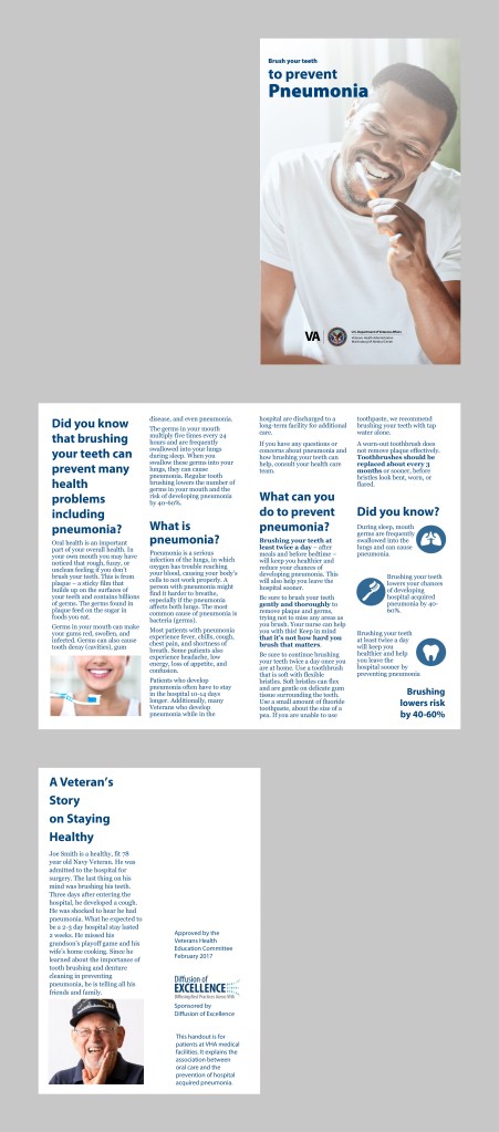
Communicating healthcare information clearly and effectively to Veterans was a priority at the Martinsburg VA Medical Center. I regularly designed booklets, brochures, and flyers to explain home care procedures and promote the classes, services, and resources available at the medical center. Each piece emphasized readability and accessibility through a clear typographic hierarchy, purposeful imagery, and compliance with Section 508 accessibility standards and ADA requirements.
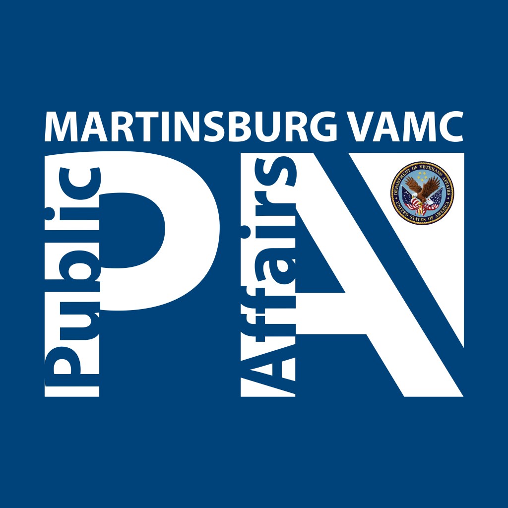
Designing temporary and permanent signage was a regular part of my work at the Martinsburg VA Medical Center, helping Veterans and staff navigate the facility. Adhering to the VA style guide, yet applying some creative typographic design, this sign was created for the entrance to the Public Affairs office, providing a clear, professional identifier that made the department easy for staff and visitors to locate.
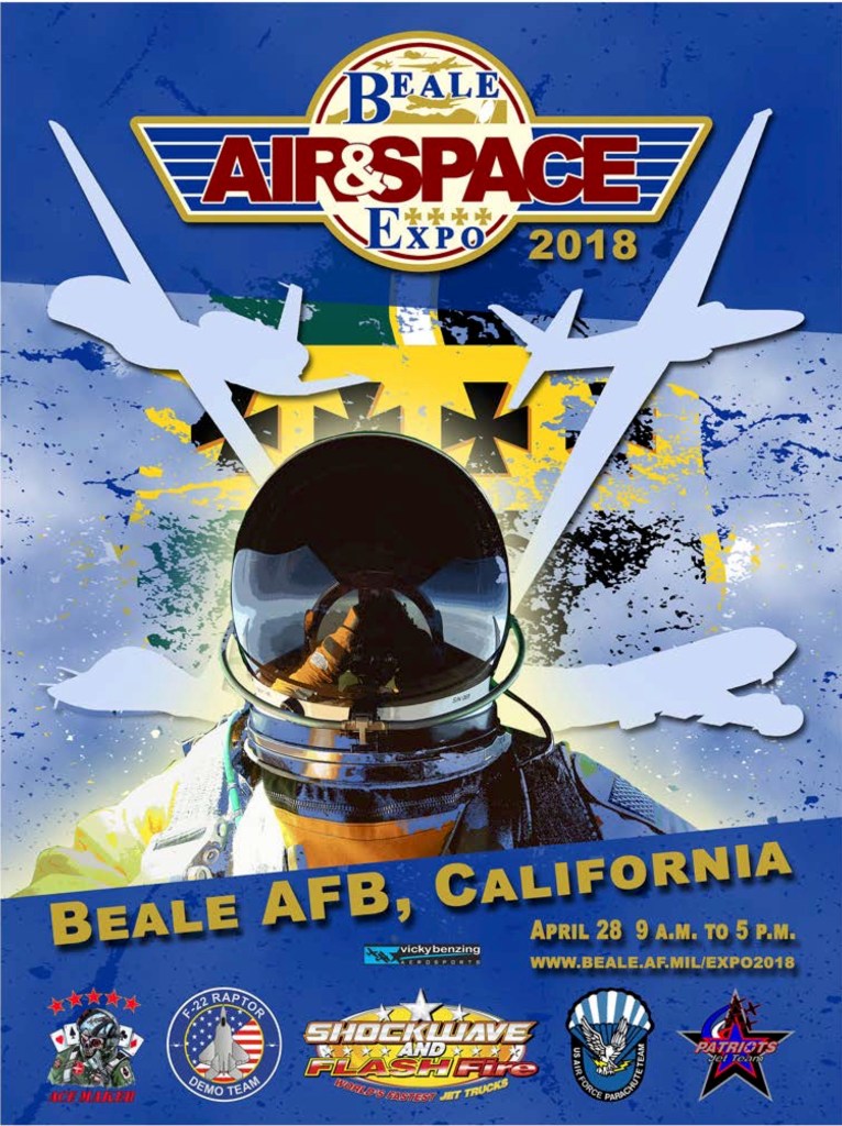
One of my largest projects at Beale Air Force Base was developing the promotional materials and signage for the 2018 Air and Space Expo. I began by exploring concepts that would capture the excitement of the event while highlighting the aircraft stationed at Beale. After developing and evaluating multiple poster concepts, I finalized a design that conveyed the energy of the expo. Through consistent communication, careful coordination with personnel, and effective time management, I completed all design and fabrication work two weeks ahead of schedule, allowing ample time for last-minute revisions.
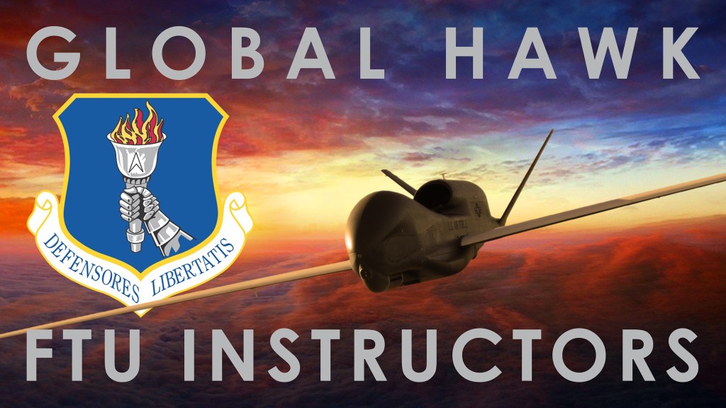
Signage was a recurring design need at Beale Air Force Base. To showcase the RQ-4 Global Hawk, I set out to create a dramatic image of the aircraft in flight against a sunset. The source photograph captured the aircraft parked on the flight line, so I used Adobe Photoshop to carefully isolate the aircraft, remove the landing gear, and refine its silhouette to eliminate visual clues that it was grounded. I then composited it into a sunset photograph, aligning the aircraft’s orientation and scale while matching the direction and quality of light between the two images. By blending the separate elements into a unified scene, I transformed a static aircraft photograph into a dynamic visual that conveyed the Global Hawk’s presence and capability.

Informational posters were a frequent design need for squadrons at Beale Air Force Base. The 9th Security Forces Squadron tasked me with creating a weapons procedures poster for use within the weapons facility. The primary challenge was organizing a substantial amount of essential information into a format that personnel could quickly scan and understand. I addressed this by establishing a clear typographic hierarchy, structuring the content into manageable sections, and incorporating the squadron’s colors to reinforce its visual identity. The result was a concise, easy-to-navigate reference designed to communicate critical procedures clearly and efficiently.
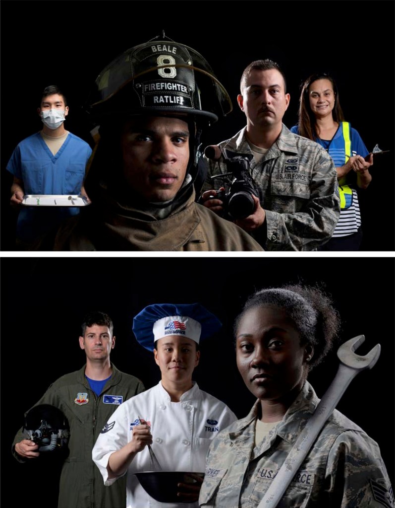
The commander wanted to replace the traditional aircraft imagery in the Beale Air Force Base headquarters conference room with photographs that highlighted the personnel behind the installation’s many missions. Representing the diverse squadrons and operations required careful selection of individuals, distinctive uniforms, and specialized equipment to communicate each person’s role.
Coordinating a single photoshoot with multiple personnel proved impractical, so I developed an alternative approach: photographing seven individuals in separate studio sessions and combining them into one cohesive composite. This required careful planning before the first photograph was taken. I established consistent lighting direction, quality, and intensity so each subject would appear naturally illuminated when placed alongside the others. In post-production, I meticulously extracted each individual from their original background and composited them into a single frame. I then refined their scale, positioning, and visual relationships to establish a balanced composition that felt like two unified group portraits rather than a collection of separate photographs.
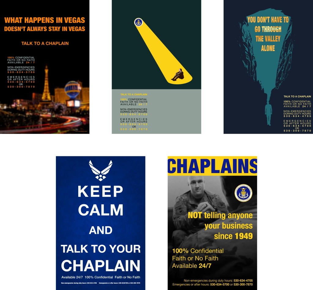
In response to growing national concerns about military suicide, the chaplains at Beale Air Force Base sought to raise awareness of their services and encourage Airmen to seek support. I was tasked with creating a series of posters to promote the campaign throughout the installation. Given the freedom to develop the concepts independently, I explored distinct visual approaches for each poster rather than relying on a single design formula. This allowed me to experiment with different imagery, compositions, and messaging strategies, giving each poster its own identity while serving the broader goal of connecting Airmen with available support.
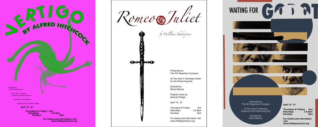
I developed three self-initiated poster projects to challenge my conceptual thinking and explore creative approaches to theatrical design. Treating each assignment as a commission from a theatre company, I researched the plays to understand their themes, tone, and underlying tensions before developing imagery that moved beyond familiar visual clichés.
For Vertigo, I combined the visual sensation of a falling figure with contrasting colors to evoke instability and disorientation. For Romeo and Juliet, I chose a minimalist depiction of a dagger to emphasize the tragedy and violence at the heart of the story rather than the conventional imagery of star-crossed lovers. For Samuel Beckett’s Waiting for Godot, I explored the absurdity and eccentricity of the two central characters, seeking to capture their peculiar predicament as they wait endlessly for someone who may never arrive. Each poster offered an opportunity to translate a complex narrative into a distinct visual concept that communicates the essence of the play through imagery, color, and composition.
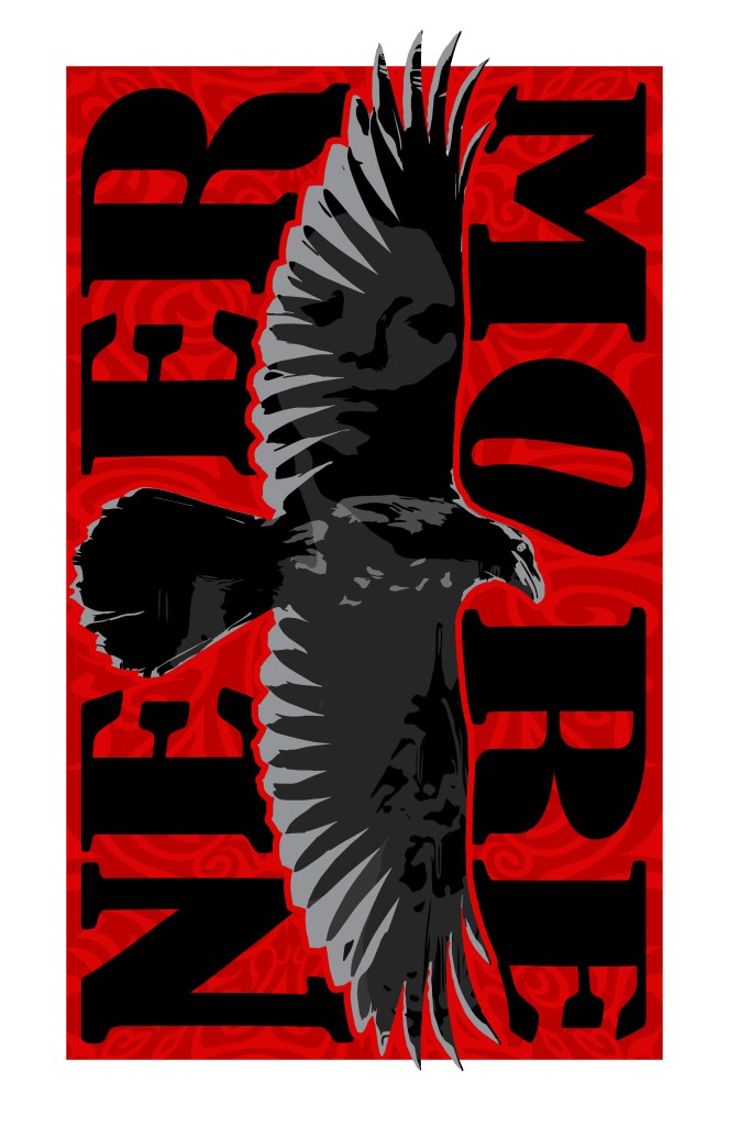
Continuing to challenge my conceptual thinking and explore typography as a visual element, I developed this design inspired by Edgar Allan Poe’s poem The Raven. I incorporated the raven’s tail into the typography, transforming part of the bird’s form into a functional design element. Through layered imagery and the integration of text and illustration, I sought to capture the poem’s dark, atmospheric character while creating a visual interpretation that extends beyond traditional typographic treatment.
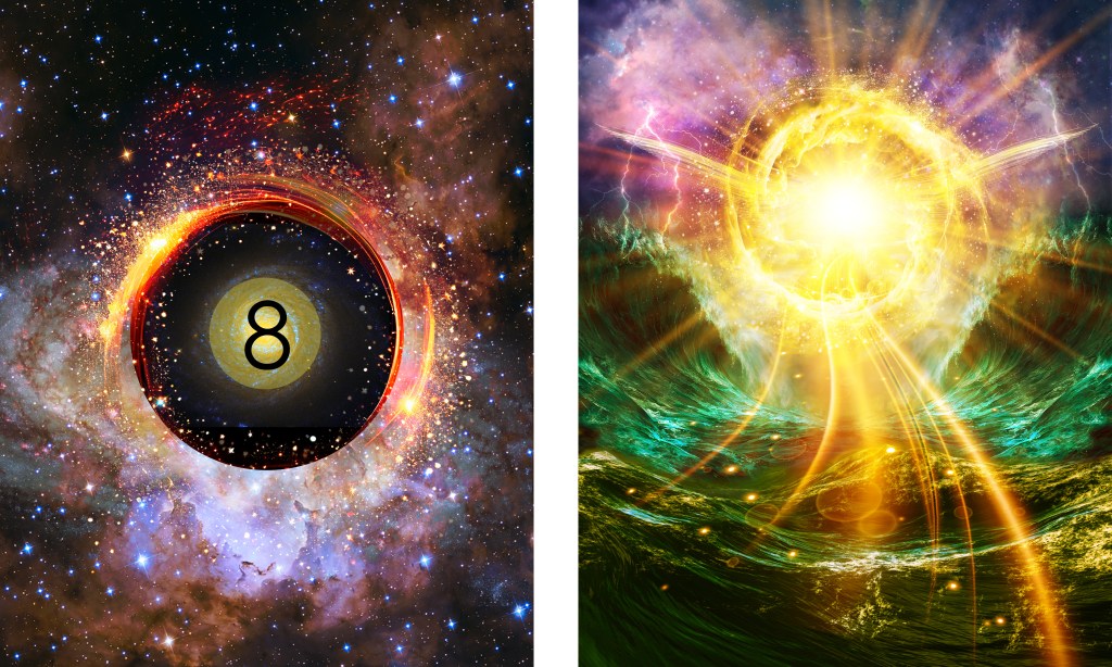
After years of creating photographic layouts and composites, I wanted to challenge myself to move beyond assembling existing images and explore digital painting as a form of conceptual expression. My goal was to develop original imagery from the ground up, translating an initial idea into a finished visuals. Cosmic Eight Ball and Genesis are the results of this exploration, demonstrating my interest in combining imagination, digital technique, and concept-driven design to create distinctive visual work.

